

Above the Fold (noun phrase) — The portion of a webpage a visitor sees immediately when the page loads, before they scroll.
What it is
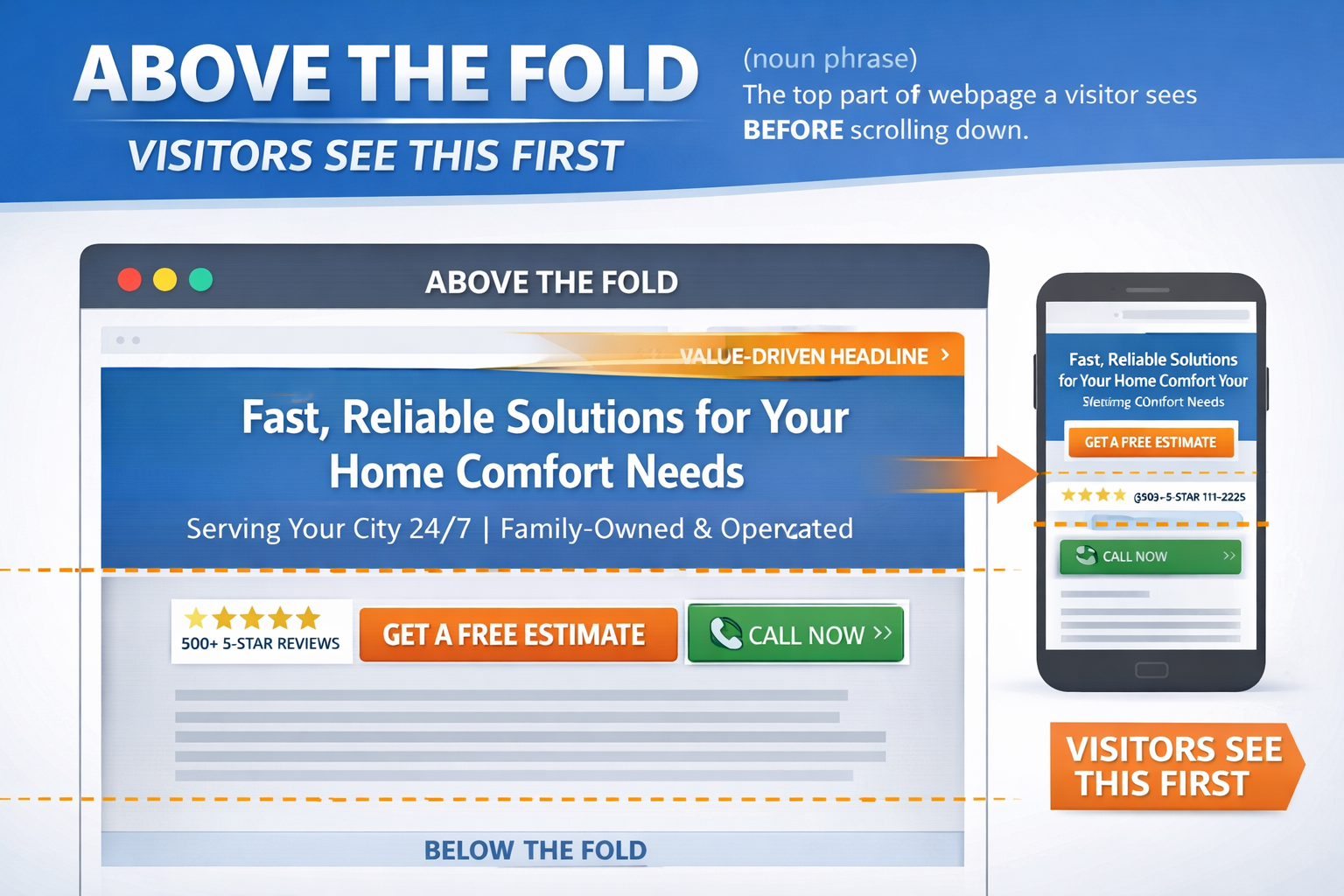
“Above the fold” refers to your page’s first-screen content: the headline, subheadline, hero image, primary call-to-action (CTA), phone number, form button, trust signals, and anything else visible without scrolling. The exact “fold” changes based on screen size (desktop vs. mobile), but the concept stays the same: what people see first.
Why it matters in digital marketing (especially lead gen)
Above-the-fold content heavily influences whether someone:
-
Stays or bounces
-
Clicks / calls / fills out a form
-
Trusts you enough to keep reading
In lead generation, visitors often decide in a few seconds if you’re the right fit. A strong above-the-fold section can increase conversion rate, lower cost per lead (CPL), and boost call volume because it makes the next step obvious.
What should usually be above the fold
-
A clear value-driven headline (what you do + who it’s for)
-
A strong CTA (Call Now / Get a Quote / Book an Estimate)
-
One key benefit or differentiator (fast response, same-day, warranty, etc.)
-
Trust signals (reviews, ratings, badges, guarantees, years in business)
-
Easy contact options (click-to-call on mobile, short form if forms are the goal)
Helpful metrics to watch
-
Bounce rate / engagement (are people leaving immediately?)
-
Scroll depth (are people making it past the fold?)
-
CTR on the primary CTA (button clicks, click-to-call taps)
-
Conversion rate (form fills, calls, bookings)
-
CPL / CPA (if running paid ads)
Where the fold actually is
The fold changes with every screen. On a large desktop monitor it sits low on the page. On a phone it can sit just below your headline. Since most local searches happen on phones, the mobile fold is the one to design for first.
What belongs above the fold on a business website
- A headline that says what you do and where you do it
- A phone number or a button people can tap to call
- One clear call to action, such as “Get a Free Estimate”
- A quick piece of proof, like a star rating or years in business
- A real photo of your work or your team
Common mistakes
Rotating image sliders push the useful part of the page out of view. A huge logo and a menu can eat the whole phone screen before any message appears. Stock photos of handshakes say nothing about your business. And hiding the phone number in the footer makes people hunt for the one thing they came to do.
Does the fold still matter?
People do scroll. But what they see first decides whether they keep going. A page that answers “am I in the right place?” in the first screen holds visitors longer, which shows up in lower bounce rate and more calls. It is not a direct ranking factor, but it shapes how people behave on the page.
How to check yours
Open your site on your own phone. Without scrolling, can you tell what the business does, where it works and how to reach it? If not, the first screen needs work. Check a couple of other phone sizes too.
Above the fold on landing pages
Ad landing pages leave even less room for error. The headline should echo the ad that brought the visitor, and the form or call button should be visible right away. Our Rocket Sites are built with the first screen doing exactly that. Let’s Talk About Your Website.
Above the fold FAQ
Is there a standard fold height?
No. It depends on the device and browser window, so test on real phones and a desktop instead of trusting one number.
Should everything important be above the fold?
No. Put your headline, proof and main action there. The rest of the page can explain and back it up as people scroll.
Do ads count as above the fold content?
Yes. A page where a pop-up or banner covers the first screen hides your message from the people you paid to bring there.